
-
Mar, Thu, 2022

HTML5
Table of Contents
1. Introduction of HTML
HTML (Hypertext Markup Language) uses a markup system composed of elements which represent specific
content. Hypertext means that the document contains links that allow the reader to jump to other places in the document or to another document altogether. A Markup Language is a way that computers speak to each other to control how text is processed and presented. To do this HTML uses two things: tags and attributes.
HTML was originally developed by Tim Berners-Lee in 1990. He is also known as the father of the web. HTML5 is the latest and most enhanced version of HTML.
HTML is sometimes called a programming language but it has no logic like Java, Ruby, PHP, etc, so is a markup language. HTML tags provide semantic meaning and machine-readability to the content in the page.
2. What You Can Do with HTML
There are lot more things you can do with HTML.
-
- You can publish documents online with text, images, lists, tables, etc.
- You can access web resources such as images, videos or other HTML document via hyperlinks.
- You can create forms to collect user inputs like name, e-mail address, comments, etc.
- You can include images, videos, sound clips, flash movies, applications and other HTML documents directly inside an HTML document.
The list does not end here, there are many other interesting things that you can do with HTML. You will learn about all of them in detail in upcoming chapters.
3. Creating a simple page
The following HTML example creates a simple “Hello World” web page. HTML files can be created using any text editor. We suggest you to use SubLime Text Editor or Notepad++.
Step 1: Creating the HTML file
An HTML file is simply a text file saved with an .html or .htm extension in order to be recognized as HTML files by browser. Open up your computer’s text editor and create a new file myfirstpage.html
Step 2: Type some HTML code
Type the following code:
<!DOCTYPE html>
<html lang="en">
<head>
    <meta charset="UTF-8">
    <title>Hello!</title>
</head>
<body>
    <h1>Hello World!</h1>
    <p>This is a simple paragraph.</p>
</body>
</html>
Step 3: Saving the file
Now save the file as “myfirstpage.html “.
Note: It is important that the extension .html is specified — some text editors, such as Notepad, will automatically save it as .txt otherwise.
Step 4: Open File in Browser
Once created, this file can be opened in any web browser. Navigate to your file then double click on it. It will open in your default Web browser. If it does not, open your browser and drag the file to it.
4. Explanation of code
You might think what that code was all about. Well, let’s find out
<!DOCTYPE> => The first line <!DOCTYPE html> is the document type declaration. It instructs the web browser that this document is an HTML5 document. It is case-insensitive.
<html> => Opens the page. No markup should come after the closing tag (</html>). The lang attribute declares
the primary language of the page using the ISO language codes (en for English).
<head> => Opens the head section, which does not appear in the main browser window but mainly contains
information about the HTML document, called metadata. It can also contain imports from external
stylesheets and scripts. The closing tag is </head>.
<meta> => Gives the browser some metadata about the document. The charset attribute declares the character
encoding. Modern HTML documents should always use UTF-8, even though it is not a requirement. In
HTML, the <meta> tag does not require a closing tag.
<title> => The title of the page. Text written between this opening and the closing tag (</title>) will be
displayed on the tab of the page or in the title bar of the browser.
<body> => Opens the part of the document displayed to users, i.e. all the visible or audible content of a page. No
content should be added after the closing tag </body>.
<h1> => A level 1 heading for the page.
<p> => Represents a common paragraph of text.
5. Doctypes
The first line of any HTML document starts with the Doctype (Document Type Declaration). This is the part that, if we are honest, gets added automatically by our code editor of choice or we can paste it from an existing boilerplate (nobody really enters the full HTML 4.01 Doctype out, do they?)
Before HTML5, the Doctype for a standard HTML 4.01 page would have looked as follows:
<!DOCTYPE HTML PUBLIC "-//W3C//DTD HTML 4.01 Transitional//EN"
"http://www.w3.org/TR/html4/loose.dtd">
Now, with HTML5, it’s merely as follows:
<!DOCTYPE html>
Case Insensitivity
A DOCTYPE string is an case-insensitive, therefore the following DOCTYPEs are also valid:
<!doctype html>
<!dOCtyPe html>
<!DocTYpe html>
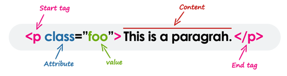
6. What is an Element in HTML?
An element usually consists of an opening tag (), a closing tag (), which contain the element’s name surrounded by angle brackets, and the content in between: …content…
You need a web browser to view the HTML pages. The web browsers do not display the HTML tags, but uses the tags to interpret the content of the web pages.
Element names can be thought of as descriptive keywords for the content they contain, such as video, audio, table, footer.
A HTML page may consist of potentially hundreds of elements which are then read by a web browser, interpreted and rendered into human readable or audible content on the screen.
For this document it is important to note the difference between elements and tags:
Elements: video, audio, table, footer footer Tags:
Tags: <video>, <audio>, <table>, <footer>, </html>, </body>
Element insight in HTML
Let’s break down a tag…
The <p> tag represents a common paragraph.
Elements commonly have an opening tag and a closing tag. The opening tag contains the element’s name in angle brackets (<p>). The closing tag is identical to the opening tag with the addition of a forward slash (/) between the opening bracket and the element’s name (</p>).
Content can then go between these two tags: <p>This is a simple paragraph.</p>
Empty HTML Elements
There are some HTML elements that don’t have a closing tag or any contents. These are called Empty elements. Empty elements (also called self-closing or void elements) are not container tags — that means, you can not write <hr>some content</hr> or <br>some content</br>.
A typical example of an empty element, is the <br> element, which represents a line break. Some other common empty elements are <img>, <input>, <link>, <meta>, <hr>, etc.
Example:-
<p>This paragraph contains <br> a line break.</p>
<img src="images/rain.jpg" alt="Raining">
<input type="text" name="username">
7. Nesting HTML Elements
Placing one element inside another is called nesting. A nested element, also called a child element, can be a parent element too if other elements are nested within it.
The following example shows some elements nested inside the <p> element.
<p>Here is some <b>bold</b> text.</p>
<p>Here is some <em>emphasized</em> text.</p>
<p>Here is some <mark>highlighted</mark> text.</p>
HTML tags should be nested in correct order. They must be closed in the inverse order of how they are defined, that means the last tag opened must be closed first.
<p><strong>These tags are nested properly.</strong></p>
<p><strong>These tags are not nested properly.</p></strong>
8. Headings
HTML provides not only plain paragraph tags, but six separate header tags to indicate headings of various sizes and
thicknesses. Enumerated as heading 1 through heading 6, heading 1 has the largest and thickest text while heading
6 is the smallest and thinnest, down to the paragraph level. This topic details proper usage of these tags.
Using Headings
Headings can be used to describe the topic they precede and they are defined with the <h1> to <h6> tags. Headings
support all the global attributes.
<h1> defines the most important heading.
<h6> defines the least important heading.
Defining a heading:
<h1>Heading 1</h1>
<h2>Heading 2</h2>
<h3>Heading 3</h3>
<h4>Heading 4</h4>
<h5>Heading 5</h5>
<h6>Heading 6</h6>
In general, an article should have one h1 element for the main title followed by h2 subtitles – going down a layer if
necessary. If there are h1 elements on a higher level they shoudn’t be used to describe any lower level content.
9. Paragraphs
Paragraphs are the most basic HTML element. This topic explains and demonstrates the usage of the paragraph
element in HTML.
<p> Defines a paragraph
Example:-
<p>This is a paragraph.</p>
<p>This is another paragraph.</p>
10. Text Formatting
This topic includes examples of HTML text formatting such as highlighting,
bolding, underlining, subscript, and stricken text.
10.1 Highlighting
The <mark> element is new in HTML5 and is used to mark or highlight text in a document.
Example:-
The most common example would be in the results of a search were the user has entered a search query and
results are shown highlighting the desired query.
<p>Here is some content from an article that contains the <mark>searched query</mark>
that we are looking for. Highlighting the text will make it easier for the user to
find what they are looking for.</p>
Output:

A common standard formatting is black text on a yellow background, but this can be changed with CSS.
10.2 Bold Text
By default, the <strong> tag is typically rendered in the browser as <b>, whereas the <em> tag is rendered as <i>. However, there is a difference in the meaning of these tags.
To bold text, use the <strong> or <b> tags:
<strong>Bold Text Here</strong>
or
<b>Bold Text Here</b>
Difference between <strong> and <b> tag
Both <strong> and <b> tags render the enclosed text in a bold typeface by default, but the <strong> tag indicates that its contents have strong importance, whereas the <b> tag is simply used to draw the reader’s attention without conveying any special importance.
Example:-
<p><strong>WARNING!</strong> Please proceed with caution.</p>
<p>The concert will be held at <b>Hyde Park</b> in London.</p>
10.3 Italic Text
To italicize text, use the <em> or <i> tags:
<em>Italicized Text Here</em>
or
<i>Italicized Text Here</i>
Difference between <em> and <i> tag
Similarly, both <em> and <i> tags render the enclosed text in italic type by default, but the <em> tag indicates that its contents have stressed emphasis compared to surrounding text, whereas the <i> tag is used for marking up text that is set off from the normal text for readability reasons, such as a technical term, an idiomatic phrase from another language, a thought, etc.
Exmaple:
<p>Cats are <em>cute</em> animals.</p>
<p>The <i>Royal Cruise</i> sailed last night.</p>
10.4 Formatting Quotations
You can easily format the quotation blocks from other sources with the HTML <blockquote> tag.
Blockquotes are generally displayed with indented left and right margins, along with a little extra space added above and below. Let’s try an example to see how it works:
<blockquote>
<p>Learn from yesterday, live for today, hope for tomorrow. The important thing is not to stop questioning.</p> <cite>— Albert Einstein</cite>
</blockquote>
Tip: The cite tag is used to describe a reference to a creative work. It must include the title of that work or the name of the author (people or organization) or an URL reference.
For short inline quotations, you can use the HTML <q> tag. Most browsers display inline quotes by surrounding the text in quotation marks. Here’s an example:
<p>According to the World Health Organization (WHO): <q>Health is a state of complete physical, mental, and social well-being.</q></p>
10.5 Showing Abbreviations
An abbreviation is a shortened form of a word, phrase, or name.
You can use the <abbr> tag to denote an abbreviation. The title attribute is used inside this tag to provide the full expansion of the abbreviation, which is displayed by the browsers as a tooltip when the mouse cursor is hovered over the element. Let’s try out an example:
<p>I like to write <abbr title="Hypertext Markup Language">HTML</abbr>!</p>
10.6 Marking Contact Addresses
Web pages often include street or postal addresses. HTML provides a special tag <address> to represent contact information (physical and/or digital) for a person, people or organization.
This tag should ideally used to display contact information related to the document itself, such as article’s author. Most browsers display an address block in italic. Here’s an example:
<address>
Mozilla Foundation<br>
331 E. Evelyn Avenue<br>
Mountain View, CA 94041, USA
</address>
11. Anchors and Hyperlinks
A link or hyperlink is a connection from one web resource to another. Links allow users to move seamlessly from one page to another, on any server anywhere in the world.
A link has two ends, called anchors. The link starts at the source anchor and points to the destination anchor, which may be any web resource, for example, an image, an audio or video clip, a PDF file, an HTML document or an element within the document itself, and so on.
By default, links will appear as follow in most of the browsers:
- An unvisited link is underlined and blue.
- A visited link is underlined and purple.
- An active link is underlined and red.
However, you can overwrite this using CSS.
11.1. HTML Link Syntax
Links are specified in HTML using the <a> tag.
A link or hyperlink could be a word, group of words, or image.
<a href="url">Link text</a>
Anything between the opening <a> tag and the closing </a> tag becomes the part of the link that the user sees and clicks in a browser. Here are some examples of the links:
<a href="https://www.google.com/">Google Search</a>
<a href="https://www.thecoachsmb.com/">TheCoachSMB</a>
<a href="https://www.thecoachsmb.com/">
    <img src="kites-thumb.jpg" alt="kites">
</a>
The href attribute specifies the target of the link. Its value can be an absolute or relative URL.
An absolute URL is the URL that includes every part of the URL format, such as protocol, host name, and path of the document, e.g., https://www.google.com/, https://www.example.com/form.php, etc.
While, relative URLs are page-relative paths, e.g., contact.html, images/smiley.png, and so on. A relative URL never includes the http:// or https:// prefix.
11.2 Link to another site
<a href="http://example.com/">Link to example.com</a>
To denote that this link leads to an external website, you can use the external link type:
<a href="http://example.com/" rel="external">example site</a>
You can link to a site that uses a protocol other than HTTP. For example, to link to an FTP site, you can do,
<a href="ftp://example.com/">This could be a link to a FTP site</a>
In this case, the difference is that this anchor tag is requesting that the user’s browser connect to example.com
using the File Transfer Protocol (FTP) rather than the Hypertext Transfer Protocol (HTTP).
11.3 Link to a page on the same site
You can use a relative path to link to pages on the same website
<a href="aboutus.html">Text Here</a>
11.4 Link that dials a number
If the value of the href-attribute begins with tel:, your device will dial the number when you click it. This works on
mobile devices or on computers/tablets running software – like Skype or FaceTime – that can make phone calls
<a href="tel:11234567890">Call us</a>
Most devices and programs will prompt the user in some way to confirm the number they are about to dial.
11.5 Open link in new tab/window
The target attribute tells the browser where to open the linked document. By setting it to _blank, you tell the browser to open it in a new tab or window
Try out the following example to understand how the link's target basically works:
<a href="about-us.html" target="_blank">About Us</a>
<a href="https://www.google.com/" target="_blank">Google</a>
11.6 Link that runs email client
Basic usage
If the value of the href-attribute begins with mailto: it will try to open an email client on click:
<a href="mailto:example@example.com">Send email</a>
This will put the email address example@example.com as the recipient for the newly created email.
Cc and Bcc
You can also add addresses for cc- or bcc-recipients using the following syntax:
<a href="mailto:example@example.com?cc=john@example.com&bcc=jane@example.com">Send email</a>
Subject and body text
You can populate the subject and body for the new email as well:
<a href="mailto:example@example.com?subject=Example+subject&body=Message+text">Send email</a>
Clicking on a link with mailto: will try to open the default email client specified by your operating system or it will
ask you to choose what client you want to use. Not all options specified after the recipient’s address are supported
in all email clients.
12. Creating Bookmark Anchors
Anchors can be used to jump to specific tags on an HTML page. The tag can point to any element that has an id attribute. Anchors are mostly used to jump to a subsection of a page and are used in conjunction with header tags. Suppose you’ve created a page (page1.html) on many topics:
<h2>First topic</h2>
<p>Content about the first topic</p>
<h2>Second topic</h2>
<p>Content about the second topic</p>
Once you have several sections, you may want to create a Table of Contents at the top of the page with quick-links
(or bookmarks) to specific sections.
If you gave an id attribute to your topics, you could then link to them
<h2 id="Topic1">First topic</h2>
<p>Content about the first topic</p>
<h2 id="Topic2">Second topic</h2>
<p>Content about the second topic</p>
Now you can use the anchor in your table of contents:
<h1>Table of Contents</h1>
<a href='#Topic1'>Click to jump to the First Topic</a>
<a href='#Topic2'>Click to jump to the Second Topic</a>
These anchors are also attached to the web page they’re on (page1.html). So you can link across the site from one
page to the other by referencing the page and anchor name.
Remember, you can always <a href="page1.html#Topic1">look back in the First Topic</a> for
supporting information.
13. Creating Download Links
You can also create the file download link in exactly the same fashion as placing text links. Just point the destination URL to the file you want to be available for download.
In the following example we’ve created the download links for ZIP, PDF and JPG files.
<a href="downloads/test.zip">Download Zip file</a>
<a href="downloads/masters.pdf">Download PDF file</a>
<a href="downloads/sample.jpg">Download Image file</a>
Note: When you click a link that points to a PDF or image file, the file is not downloaded to your hard drive directly. It will only open the file in your web browser. Further you can save or download it to your hard drive on a permanent basis.
14. Lists
HTML lists are used to present list of information in well formed and semantic way. There are three different types of list in HTML and each one has a specific purpose and meaning.
- Unordered list — Used to create a list of related items, in no particular order.
- Ordered list — Used to create a list of related items, in a specific order.
- Description list — Used to create a list of terms and their descriptions.
14.1 HTML Unordered Lists
An unordered list created using the <ul> element, and each list item starts with the <li> element.
The list items in unordered lists are marked with bullets. Here’s an example:
Example
<ul>
    <li>Chocolate Cake</li>
    <li>Black Forest Cake</li>
    <li>Pineapple Cake</li>
</ul>
— The output of the above example will look something like this:
- Chocolate Cake
- Black Forest Cake
- Pineapple Cake
You can also change the bullet type in your unordered list using the CSS list-style-type property. The following style rule changes the type of bullet from the default disc to square:
Example
ul {
    list-style-type: square;
}
You should use <ul> to display a list of items, where the order of the items is not important
Nested lists
You can nest lists to represent sub-items of a list item.
<ul>
    <li>item 1</li>
    <li>item 2
         <ul>
             <li>sub-item 2.1</li>
             <li>sub-item 2.2</li>
        </ul>
    </li>
     <li>item 3</li>
</ul>
- item 1
- item 2
- sub-item 2.1
- sub-item 2.2
- item 3
14.2 HTML Ordered Lists
An ordered list created using the <ol> element, and each list item starts with the <li> element. Ordered lists are used when the order of the list’s items is important.
The list items in an ordered list are marked with numbers. Here’s an example:
Example
<ol>
    <li>Fasten your seatbelt</li>
    <li>Starts the car's engine</li>
    <li>Look around and go</li>
</ol>
— This will produce a numbered list (which is the default style):
- Fasten your seatbelt
- Starts the car’s engine
- Look around and go
Manually changing the numbers
There are a couple of ways you can play with which numbers appear on the list items in an ordered list. The first way is to set a starting number, using the start attribute. The list will start at this defined number, and continue incrementing by one as usual.
<ol start="3">
    <li>Item</li>
    <li>Some Other Item</li>
    <li>Yet Another Item</li>
</ol>
This will produce a numbered list (which is the default style):
3. Item
4. Some Other Item
5. Yet Another Item
You can also explicitly set a certain list item to a specific number. Further list items after one with a specified value will continue incrementing by one from that list item’s value, ignoring where the parent list was at.
<li value="7"></li>
It is also worth noting that, by using the value attribute directly on a list item, you can override an ordered list’s existing numbering system by restarting the numbering at a lower value. So if the parent list was already up to value 7, and encountered a list item at value 4, then that list item would still display as 4 and continue counting from that point again.
<ol start="5">
    <li>Item</li>
    <li>Some Other Item</li>
    <li value="4">A Reset Item</li>
    <li>Another Item</li>
    <li>Yet Another Item</li>
</ol>
So the example above will produce a list that follows the numbering pattern of 5, 6, 4, 5, 6 – starting again at a number lower than the previous and duplicating the number 6 in the list.
You can reverse the numbering by adding reversed in your ol element:
<ol reversed>
    <li>Item</li>
    <li>Some Other Item</li>
    <li value="4">A Reset Item</li>
    <li>Another Item</li>
    <li>Yet Another Item</li>
</ol>
Reverse numbering is helpful if you’re continually adding to a list, such as with new podcast episodes or
presentations, and you want the most recent items to appear first.
Changing the type of numeral
You can easily change the type of numeral shown in the list item marker by using the type attribute
<ol type="1|a|A|i|I">
Type Description Examples
1 Default value – Decimal numbers 1,2,3,4
a Alphabetically ordered (lowercase) a,b,c,d
A Alphabetically ordered (uppercase) A,B,C,D
i Roman Numerals (lowercase) i,ii,iii,iv
I Roman Numerals (uppercase) I,II,III,IV
14. 3 HTML Description Lists
A description list is a list of items with a description or definition of each item.
The description list is created using <dl> element. The <dl> element is used in conjunction with the <dt> element which specify a term, and the <dd> element which specify the term’s definition.
Browsers usually render the definition lists by placing the terms and definitions in separate lines, where the term’s definitions are slightly indented. Here’s an example:
Example
<dl>
    <dt>Bread</dt>
    <dd>A baked food made of flour.</dd>
    <dt>Coffee</dt>
    <dd>A drink made from roasted coffee beans.</dd>
</dl>
— The output of the above example will look something like this:
- Bread
- A baked food made of flour.
- Coffee
- A drink made from roasted coffee beans.
15. HTML Tables
HTML table allows you to arrange data into rows and columns. They are commonly used to display tabular data like product listings, customer’s details, financial reports, and so on.
You can create a table using the <table> element. Inside the <table> element, you can use the <tr> elements to create rows, and to create columns inside a row you can use the <td> elements. You can also define a cell as a header for a group of table cells using the <th> element.
The following example demonstrates the most basic structure of a table.
Example
<table>
   <tr>
      <th>Heading 1/Column 1</th>
      <th>Heading 2/Column 2</th>
   </tr>
   <tr>
      <td>Row 1 Data Column 1</td>
      <td>Row 1 Data Column 2</td>
   </tr>
   <tr>
      <td>Row 2 Data Column 1</td>
      <td>Row 2 Data Column 2</td>
   </tr>
</table>
This will render a <table> consisting of three total rows (<tr>): one row of header cells (<th>) and two rows of
content cells (<td>). <th> elements are tabular headers and <td> elements are tabular data. You can put whatever
you want inside a <td> or <th>
Heading 1/Column 1 Heading 2/Column 2
Row 1 Data Column 1 Row 1 Data Column 2
Row 2 Data Column 1 Row 2 Data Column 2
Tables do not have any borders by default. You can use the CSS border property to add borders to the tables. Also, table cells are sized just large enough to fit the contents by default. To add more space around the content in the table cells you can use the CSS padding property.
The following style rules add a 1-pixel border to the table and 10-pixels of padding to its cells.
Example
table, th, td {
    border: 1px solid black;
}
th, td {
    padding: 10px;
}
By default, borders around the table and their cells are separated from each other. But you can collapse them into one by using the border-collapse property on the <table> element.
Also, text inside the <th> elements are displayed in bold font, aligned horizontally center in the cell by default. To change the default alignment you can use the CSS text-align property.
The following style rules collapse the table borders and align the table header text to left.
Example
table {
    border-collapse: collapse;
}
th {
    text-align: left;
}
Note: Most of the <table> element’s attribute such as border, cellpadding, cellspacing, width, align, etc. for styling table appearances in earlier versions has been dropped in HTML5, so avoid using them. Use CSS to style HTML tables instead.
15.1 Spanning Multiple Rows and Columns
Spanning allow you to extend table rows and columns across multiple other rows and columns.
Normally, a table cell cannot pass over into the space below or above another table cell. But, you can use the rowspan or colspan attributes to span multiple rows or columns in a table.
Let’s try out the following example to understand how colspan basically works:
Example
<table>
    <tr>
        <td>row 1 col 1</td>
        <td>row 1 col 2</td>
        <td>row 1 col 3</td>
    </tr>
    <tr>
        <td colspan="3">This second row spans all three columns</td>
    </tr>
    <tr>
        <td rowspan="2">This cell spans two rows</td>
        <td>row 3 col 2</td>
        <td>row 3 col 3</td>
    </tr>
    <tr>
        <td>row 4 col 2</td>
        <td>row 4 col 3</td>
     </tr>
</table>
Will result in
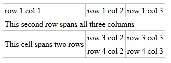
Note that you should not design a table where both rows and columns overlap as this is invalid HTML and the result
is handled differently by different web browsers.
rowspan = A non-negative integer that specifies the number of rows spanned by a cell. The default value of this attribute is one (1). A value of zero (0) means that the cell will extend from the current row until the last row of the table (,, or).
colspan = A non-negative integer that specifies the number of columns spanned by the current cell. The default value of this attribute is one (1). A value of zero (0) means that the cell will extend from the current to the last column of the column group in which the cell is defined.
Similarly, you can use the rowspan attribute to create a cell that spans more than one row. Let’s try out an example to understand how row spanning basically works:
Example
<table>
    <tr>
        <th>Name:</th>
        <td>John Carter</td>
    </tr>
    <tr>
        <th rowspan="2">Phone:</th>
        <td>55577854</td>
    </tr>
    <tr>
        <td>55577855</td>
    </tr>
</table>
15.2 Adding Captions to Tables
You can specify a caption (or title) for your tables using the <caption> element.
The <caption> element must be placed directly after the opening <table> tag. By default, caption appears at the top of the table, but you can change its position using the CSS caption-side property.
The following example shows how to use this element in a table.
Example
<table>
    <caption>Users Info</caption>
    <tr>
        <th>No.</th>
        <th>Name</th>
        <th>Age</th>
    </tr>
    <tr>
        <td>1</td>
        <td>Peter Parker</td>
        <td>16</td>
    </tr>
    <tr>
        <td>2</td>
        <td>Clark Kent</td>
        <td>34</td>
    </tr>
</table>
15.3 Defining a Table Header, Body, and Footer
HTML provides a series of tags <thead>, <tbody>, and <tfoot> that helps you to create more structured table, by defining header, body and footer regions, respectively.
The following example demonstrates the use of these elements.
Example
<table>
    <thead>
        <tr>
            <th>Items</th>
            <th>Expenditure</th>
        </tr>
    </thead>
    <tbody>
        <tr>
            <td>Stationary</td>
            <td>2,000</td>
        </tr>
        <tr>
            <td>Furniture</td>
            <td>10,000</td>
        </tr>
    </tbody>
    <tfoot>
        <tr>
            <th>Total</th>
            <td>12,000</td>
        </tr>
    </tfoot>
</table>16. HTML Images
Images enhance visual appearance of the web pages by making them more interesting and colorful.
16.1 Creating an image
To add an image to a page, use the image tag. Image tags (img) do not have closing tags. The <img> tag is used to insert images in the HTML documents. It is an empty element and contains attributes only. The syntax of the <img> tag can be given with:
<img src="url" alt="some_text">
The following example inserts three images on the web page:
<img src="kites.jpg" alt="Flying Kites">
<img src="sky.jpg" alt="Cloudy Sky">
<img src="balloons.jpg" alt="Balloons">
Each image must carry at least two attributes: the src attribute, and an alt attribute.
The src attribute tells the browser where to find the image. Its value is the URL of the image file.
16.2 Choosing alt text
Alt-text is used by screen readers for visually impaired users and by search engines. It’s therefore important to
write good alt-text for your images.
The alt attribute provides an alternative text for the image, if it is unavailable or cannot be displayed for some reason. Its value should be a meaningful substitute for the image.
Note: Like <br> , the <img> element is also an empty element, and does not have a closing tag.
Tip: The required alt attribute provides alternative text description for an image if a user for some reason cannot able to view it because of slow connection, image is not available at the specified URL, or if the user uses a screen reader or non-graphical browser.
16.3 Setting the Width and Height of an Image
The width and height attributes are used to specify the width and height of an image.
The values of these attributes are interpreted in pixels by default.
Example:
<img src="kites.jpg" alt="Flying Kites" width="300" height="300">
<img src="sky.jpg" alt="Cloudy Sky" width="250" height="150">
<img src="balloons.jpg" alt="Balloons" width="200" height="200">
You can also use the style attribute to specify width and height for the images. It prevents style sheets from changing the image size accidently, since inline style has the highest priority.
<img src="kites.jpg" alt="Flying Kites" style="width: 300px; height: 300px;">
<img src="sky.jpg" alt="Cloudy Sky" style="width: 250px; height: 150px;">
<img src="balloons.jpg" alt="Balloons" style="width: 200px; height: 200px;">
Note: It’s a good practice to specify both the width and height attributes for an image, so that browser can allocate that much of space for the image before it is downloaded. Otherwise, image loading may cause distortion or flicker in your website layout.
17. HTML Forms
HTML Forms are required to collect different kinds of user inputs, such as contact details like name, email address, phone numbers, or details like credit card information, etc.
Forms contain special elements called controls like inputbox, checkboxes, radio-buttons, submit buttons, etc. Users generally complete a form by modifying its controls e.g. entering text, selecting items, etc. and submitting this form to a web server for further processing.
The <form> tag is used to create an HTML form. Here’s a simple example of a login form:
Example:
<form>
    <label>Username: <input type="text"></label>
    <label>Password: <input type="password"></label>
    <input type="submit" value="Submit">
</form>
The following section describes different types of controls that you can use in your form.
Input Element
This is the most commonly used element within HTML forms.
It allows you to specify various types of user input fields, depending on the type attribute. An input element can be of type text field, password field, checkbox, radio button, submit button, reset button, file select box, as well as several new input types introduced in HTML5.
The most frequently used input types are described below.
17.1 Text Fields
Text fields are one line areas that allow the user to input text.
Single-line text input controls are created using an <input> element, whose type attribute has a value of text. Here’s an example of a single-line text input used to take username:
<form>
    <label for="username">Username:</label>
    <input type="text" name="username" id="username">
</form>
— The output of the above example will look something like this:
Syntax
<input type="text">
or (without specifying a type, using the default attribute):
<input>
The default width of a text field input is 20 characters. This can be changed by specifying a value for the size
attribute like this:
<input type="text" size="50">
The size attribute is distinctly different than setting a width with CSS. Using a width defines a specific value (in number of pixel, percentage of the parent element, etc.) that the input must always be wide. Using the size calculates the amount of width to allocate based on the font being used and how wide the characters normally are.
Note: Using the size attribute does not inherently limit the number of characters which can be entered into the box, only how wide the box is displayed. For limiting the length, see Input Validation.
An input field only allows one line of text. If you need a multi-line text input for substantial amount of text, use a
<textarea>
Note: The <label> tag is used to define the labels for <input> elements. If you want your user to enter several lines you should use a <textarea> instead.
17.2 Password Field
Password fields are similar to text fields. The only difference is; characters in a password field are masked, i.e. they are shown as asterisks or dots. This is to prevent someone else from reading the password on the screen. This is also a single-line text input controls created using an <input> element whose type attribute has a value of password.
Here’s an example of a single-line password input used to take user password:
Example
<form>
    <label for="user-pwd">Password:</label>
    <input type="password" name="user-password" id="user-pwd">
</form>
— The output of the above example will look something like this:
<input type="password" name="password" placeholder="Password">
Placeholder text is shown in plain text and is overwritten automatically when a user starts typing.
17.3 Radio Buttons
Radio buttons usually come in groups (if it’s not grouped with another radio button, you probably meant to use a
checkbox instead) identified by using the same name attribute on all buttons within that group. The selection of
radio buttons are mutually exclusive, meaning the user may only select one choice from a group of radio buttons.
When a radio button is checked, any other radio button with the same name that was previously checked becomes
unchecked.
Radio buttons are used to let the user select exactly one option from a pre-defined set of options. It is created using an <input> element whose type attribute has a value of radio.
Here’s an example of radio buttons that can be used to collect user’s gender information:
Example
<form>
    <input type="radio" name="gender" id="male">
    <label for="male">Male</label>
    <input type="radio" name="gender" id="female">
    <label for="female">Female</label>
</form>
— The output of the above example will look something like this:
<input type="radio" name="color" id="red" value="#F00">
<input type="radio" name="color" id="green" value="#0F0">
<input type="radio" name="color" id="blue" value="#00F">
When viewed, radio buttons appear as a circle (unchecked) or a filled circle (checked). Checkboxes appear as a
square (unchecked) or a filled square (checked). Depending on the browser and operating system, the square
sometimes has rounded corners
Accessibility
Labels
To give context to the buttons and show users what each button is for, each of them should have a label. This can be done using a
<label>
<input type="radio" name="color" value="#F00">
Red
</label>
or with a <label>
<input type="checkbox" name="color" value="#F00" id="red">
<label for="red">Red</label>
Button Groups
Since each radio button affects the others in the group, it is common to provide a label or context for the entire
group of radio buttons.
To provide a label for the entire group, the radio buttons should be included in a <fieldset> element with a
<legend> element within it.
Example:
<fieldset>
<legend>Theme color:</legend>
<p>
<input type="radio" name="color" id="red" value="#F00">
<label for="red">Red</label>
</p>
<p>
<input type="radio" name="color" id="green" value="#0F0">
<label for="green">Green</label>
</p>
<p>
<input type="radio" name="color" id="blue" value="#00F">
<label for="blue">Blue</label>
</p>
</fieldset>
17.4 Checkboxes
Checkboxes allows the user to select one or more option from a pre-defined set of options. It is created using an <input> element whose type attribute has a value of checkbox.
Here’s an example of checkboxes that can be used to collect information about user’s hobbies:
Example
<form>
    <input type="checkbox" name="sports" id="soccer">
    <label for="soccer">Soccer</label>
    <input type="checkbox" name="sports" id="cricket">
    <label for="cricket">Cricket</label>
    <input type="checkbox" name="sports" id="baseball">
    <label for="baseball">Baseball</label>
</form>
— The output of the above example will look something like this:
18. Input Validation
HTML input validation is done automatically by the browser based on special attributes on the input element. It
could partially or completely replace JavaScript input validation. This kind of validation can be circumvented by the
user via specially crafted HTTP requests, so it does not replace server-side input validation. The validation only
occurs when attempting to submit the form, so all restricted inputs must be inside a form in order for validation to
occur (unless you’re using JavaScript). Keep in mind that inputs which are disabled or read-only will not trigger
validation.
Some newer input types (like email, url, tel, date and many more ) are automatically validated and do not require
your own validation constraints.
Version ≥ 5
Required
Use the required attribute to indicate that a field must be completed in order to pass validation.
<input required>
Minimum / Maximum Length
Use the minlength and maxlength attributes to indicate length requirements. Most browsers will prevent the user
from typing more than max characters into the box, preventing them from making their entry invalid even before
they attempt submission.
<input minlength="3">
<input maxlength="15">
<input minlength="3" maxlength="15">
Specifying a range
Use min and max attributes to restrict the range of numbers a user can input into an input of type number or range
Marks: <input type="number" size="6" name="marks" min="0" max="100" />
Subject Feedback: <input type="range" size="2" name="feedback" min="1" max="5" />
Accept File Type
For input fields of type file, it is possible to accept only certain types of files, such as videos, images, audios,
specific file extensions, or certain media types. For example:
<input type="file" accept="image/*" title="Only images are allowed">
Multiple values can be specified with a comma, e.g.:
<input type=”file” accept=”image/*,.rar,application/zip”>
<input type="file" accept="image/*" multiple title="Only images are allowed">Color
Version ≥ 5
<input type="color" name="favcolor" value="#ff0000">
In supporting browsers, the input element with a type attribute whose value is color creates a button-like control,
with a color equal to the value of color attribute (defaults to black if value is not specified or is an invalid
hexadecimal format)
Clicking this button opens the operating system’s color widget, which allows user to select a color
Fallback for browsers which do not support this input type is a regular input type=text.
File
<input type="file" name="fileSubmission">
File inputs allow users to select a file from their local filesystem for use with the current page. If used in conjunction
with a form element, they can be used to allow users to upload files to a server
The following example allows users to use the file input to select a file from their filesystem and upload that file to
a script on the server named upload_file.php
<form action="upload_file.php" method="post" enctype="multipart/form-data">
Select file to upload:
<input type="file" name="fileSubmission" id="fileSubmission">
<input type="submit" value="Upload your file" name="submit">
</form>
Multiple files
Adding the multiple attribute the user will be able to select more than one file:
<input type="file" name="fileSubmission" id="fileSubmission" multiple>
Accept Files
Accept attribute specifies the types of files that user can select. E.g. .png, .gif, .jpeg.
<input type="file" name="fileSubmission" accept="image/x-png,image/gif,image/jpeg" />
Button
<input type="button" value="Button Text">
Buttons can be used for triggering actions to occur on the page, without submitting the form. You can also use the
<button> element if you require a button that can be more easily styled or contain other elements:
<button type="button">Button Text</button>
Buttons are typically used with an “onclick” event:
<input type="button" onclick="alert('hello world!')" value="Click Me">
or
<button type="button" onclick="alert('hello world!')">Click Me</button>
Hidden
<input type="hidden" name="inputName" value="inputValue">
A hidden input won’t be visible to the user, but its value will be sent to the server when the form is submitted
nonetheless.
Input Type Tel
<input type="tel" value="+8400000000">
The tel input type can be used for entering a telephone number.
Browsers don’t support tel input validation natively. However, you can use the placeholder attribute to help users in entering the correct format for a phone number, or specify a regular expression to validate the user input using the pattern attribute. Let’s check out an example:
<form>
<label for="myphone">Telephone Number:</label>
<input type="tel" id="myphone" placeholder="xx-xxxx-xxxx" required>
</form>
The input element with a type attribute whose value is tel represents a one-line plain-text edit control for entering
a telephone number.
Note: The validation for tel input (i.e. type="tel") is currently not supported by any browser because format for phone numbers vary so much across countries, but it is still useful. Mobile browsers display a numeric keyboard for tel input field for entering phone numbers.
Input Type Number
The number input type can be used for entering a numerical value. You can also restrict the user to enter only acceptable values using the additional attributes min, max, and step.
The following example will allow you to enter a numeric value between 1 to 10.
Example
<form>
<label for="mynumber">Enter a Number:</label>
<input type="number" min="1" max="10" step="0.5" id="mynumber">
</form>
Note: The number input (i.e. type="number") is supported by all major web browsers such as Firefox, Chrome, Safari, Opera, Internet Explorer 10 and above. Internet Explorer however recognized the number but do not provide increment and decrement spin buttons.
Input Type Range
The range input type can be used for entering a numerical value within a specified range. It works very similar to number input, but it offers a simpler control for entering a number.
Let’s try out the following example to understand how it basically works:
<form>
<label for="mynumber">Select a Number:</label>
<input type="range" min="1" max="10" step="0.5" id="mynumber">
</form>
Note: The range input (i.e. type="range") is supported by all major web browsers such as Firefox, Chrome, Safari, Opera, Internet Explorer 10 and above.
Input Type Search
The search input type can be used for creating search input fields.
A search field typically behaves like a regular text field, but in some browsers like Chrome and Safari as soon as you start typing in the search box a small cross appears on the right side of the field that lets you quickly clear the search field. Let’s try out an example to see how it works:
Example
<form><label for="mysearch">Search Website:</label><input type="search" id="mysearch"></form>
Note: The search input (i.e. type="search") is supported by all major web browsers such as Firefox, Chrome, Safari, Opera, Internet Explorer 10 and above.
Input Type Time
The time input type can be used for entering a time (hours and minutes).
Browser may use 12- or 24-hour format for inputting times, based on local system’s time setting.
<form>
 <label for="mytime">Select Time:</label>
 <input type="time" id="mytime">
</form>
Warning: The input type="time" is not supported by Internet Explorer and Safari browsers. Currently supported by Chrome, Firefox, Edge, and Opera browsers.
Input Type Date
The date input type allows the user to select a date from a drop-down calendar.
The date value includes the year, month, and day, but not the time.
Example
<form>
    <label for="mydate">Select Date:</label>
    <input type="date" value="2019-04-15" id="mydate">
</form>Input Type Datetime-local
The datetime-local input type allows the user to select both local date and time, including the year, month, and day as well as the time in hours and minutes.
Let’s try out the following example to understand how it basically works:
Example
<form>
    <label for="mydatetime">Choose Date and Time:</label>
    <input type="datetime-local" id="mydatetime">
</form>Input Type Week
The week input type allows the user to select a week and year from a drop-down calendar.
Let’s try out the following example to understand how this works:
Example
<form>
    <label for="myweek">Select Week:</label>
    <input type="week" id="myweek">
</form>Input Type Month
The month input type allows the user to select a month and year from a drop-down calendar.
The value is a string in the format “YYYY-MM”, where YYYY is the four-digit year and MM is the month number. Let’s try out an example to see how this basically works:
Example:
<form>
<label for="mymonth">Select Month:</label>
<input type="month" id="mymonth">
</form>
Warning: The input type="month" is not supported by Firefox, Safari and Internet Explorer browsers. Currently supported in Chrome, Edge, and Opera browsers.
19. Form Submitting
The Action Attribute
The action attribute defines the action to be performed when the form is submitted, which usually leads to a script
that collects the information submitted and works with it. if you leave it blank, it will send it to the same file
<form action="action.php">
The Method Attribute
The method attribute is used to define the HTTP method of the form which is either GET or POST.
<form action="action.php" method="get">
<form action="action.php" method="post">
The GET method is mostly used to get data, for example to receive a post by its ID or name, or to submit a search
query. The GET method will append the form data to the URL specified in the action attribute.
http://www.example.com/action.php?firstname=Mickey&lastname=Mouse
The POST method is used when submitting data to a script. The POST method does not append the form data to
the action URL but sends using the request body.
To submit the data from the form correctly, a name attribute name must be specified.
As an example let’s send the value of the field and set its name to lastname:
<input type="text" name="lastname" value="Mouse">
More attributes